Olympic Identity Reimagining
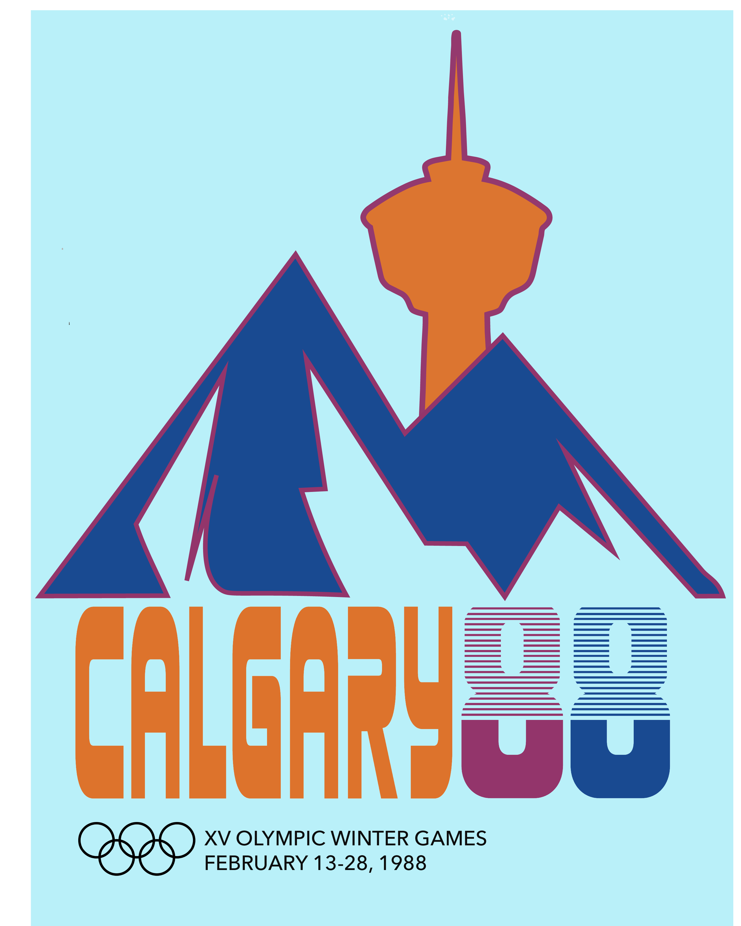
Calgary ‘88 is a conceptual reimagining of the 1988 Winter Olympics visual identity. While the original mark emphasized structure and corporate precision, this redesign explores the energy, movement, and visual culture of the late 1980s through a more expressive identity system.
The project included logo development, environmental graphics, event branding, and promotional applications. Inspired by the landscapes of Southern Alberta, the identity combines bold typography, dynamic forms, and a color palette drawn from the Rocky Mountains, Western prairies, and the Bow River.
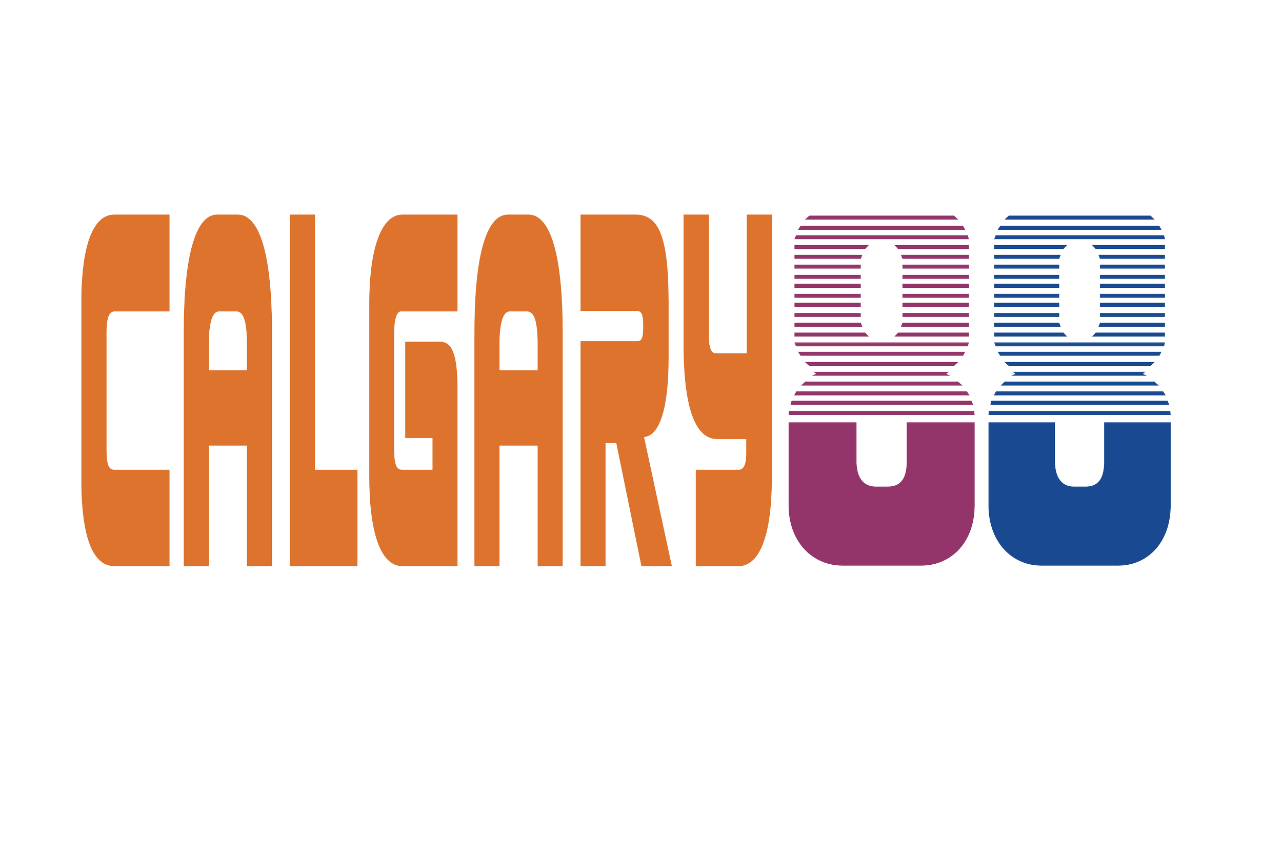
The logo embraces the movement and rhythm of the late 1980s. The 88 symbolizes the Chinook winds that sweep down the Rockies to warm the city.
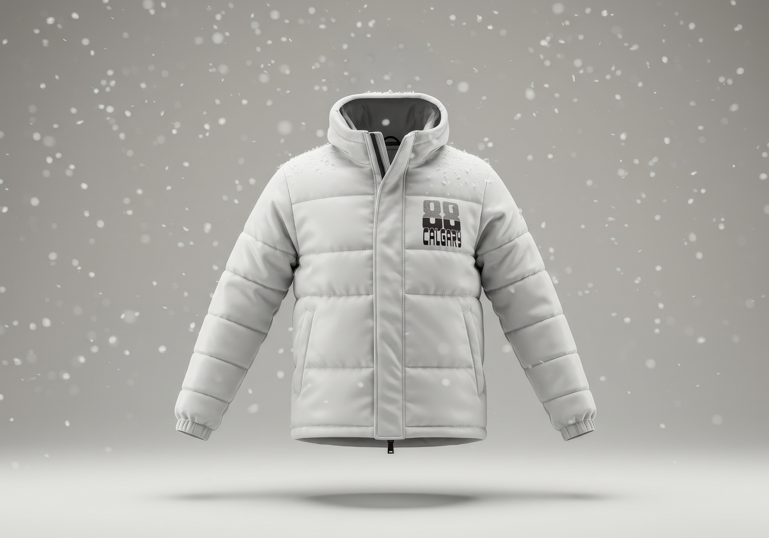
Official sportswear
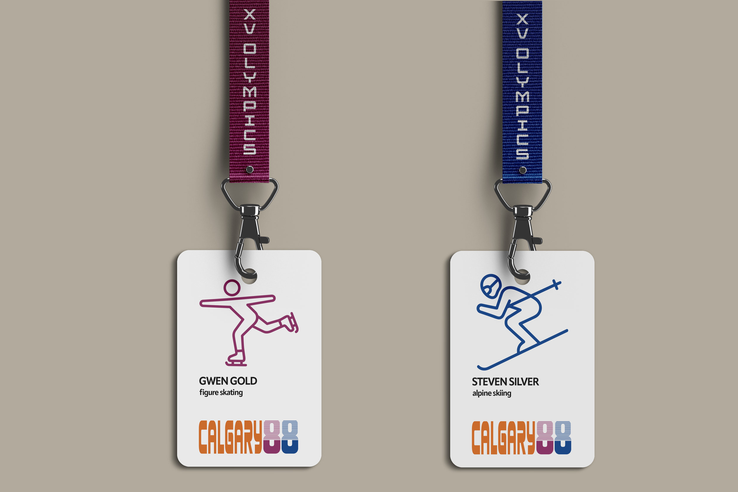
ATHLETE LANYARDS
PRAIRIE VIOLET IS USED FOR SKATING SPORTS, WITH BOW RIVER BLUE USED FOR ALPINE SPORTS EVENTS.